REAL ESTATE AGENCY
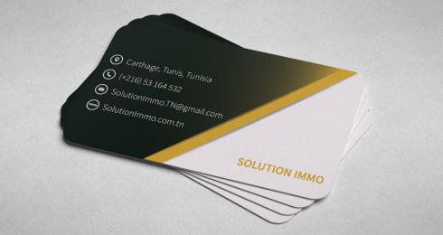
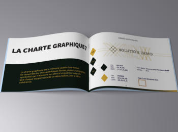
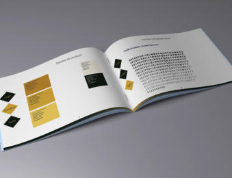
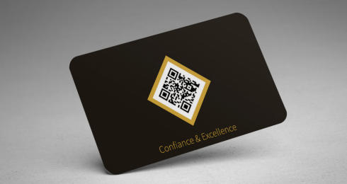
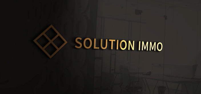
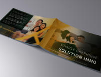
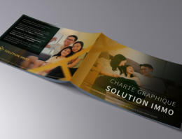
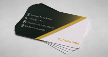
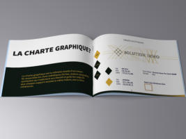
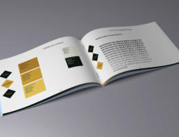
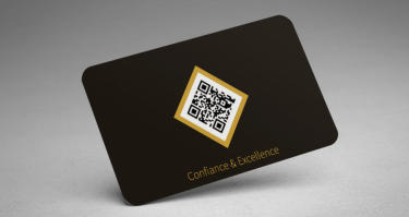
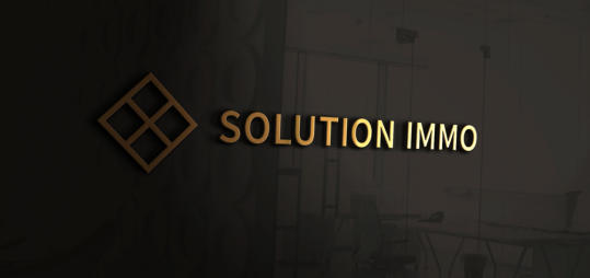
The visual identity is built on a refined and elegant
color system combining a deep dark green (#0F1A14)
with a warm golden tone (#D3A63A). The dark green
conveys stability, sophistication, and trust, creating
a strong and premium visual foundation, while the
gold accent introduces a sense of value, prestige,
and warmth. This contrast establishes a balanced
hierarchy between seriousness and refinement, allowing
the brand to feel both professional and distinctive.
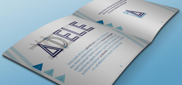
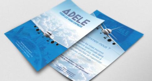
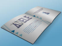
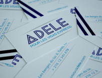
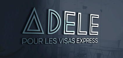
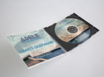
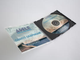
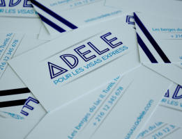
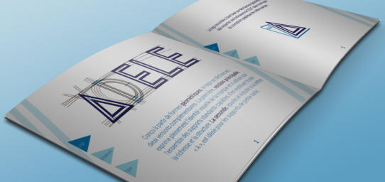
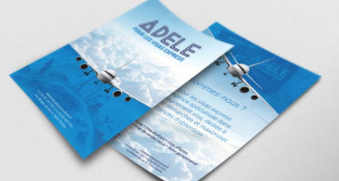
TRAVEL AGENCY
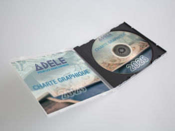
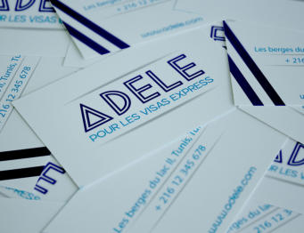
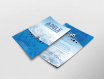
The identity combines a geometric triangular symbol
and structured typography to express direction,
precision, and guidance through complex visa
procedures. A blue palette was chosen to convey
trust, reliability, and institutional credibility while
maintaining visual clarity. The system adapts
consistently across print and digital
media,
reinforcing a professional and efficient brand
presence.
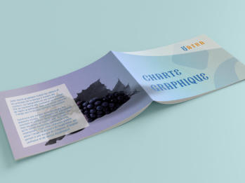
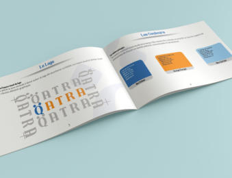
JUICE STORE
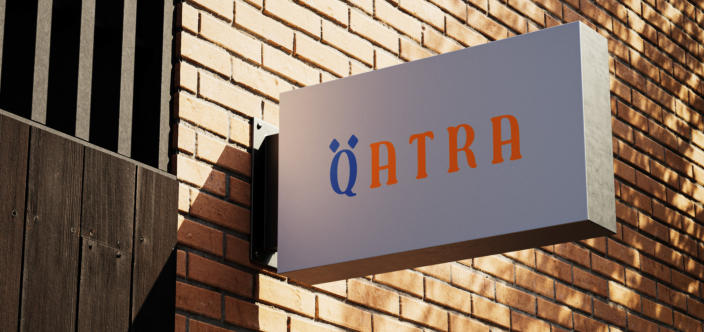
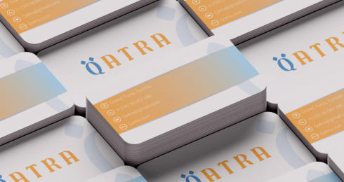
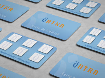
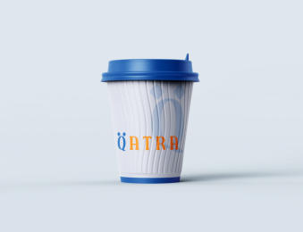
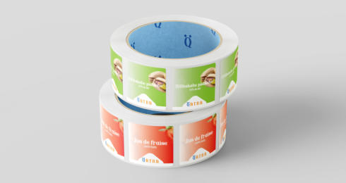
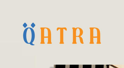
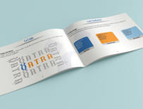
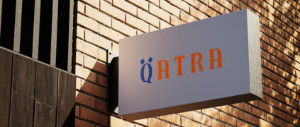
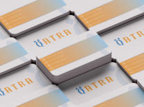
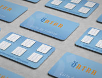
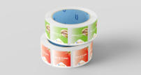
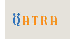
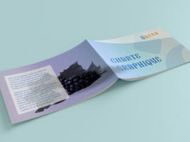
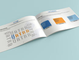
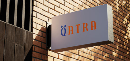
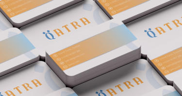
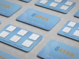
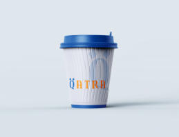
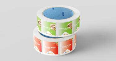
QATRA is a juice shop brand identity developed
around the idea of purity, freshness, and natural
simplicity, deeply rooted in the Arabic meaning of
its name, which translates to “a drop of water.”
This conceptual foundation guided the entire
visual direction, aiming to express both hydration
and vitality through a modern and culturally
meaningful design language.
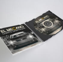
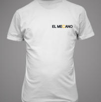
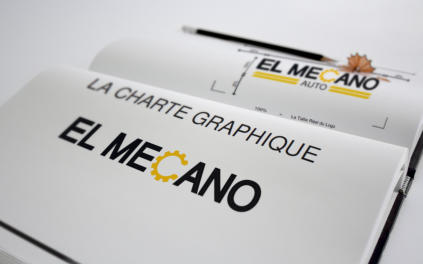
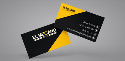
CAR GARAGE
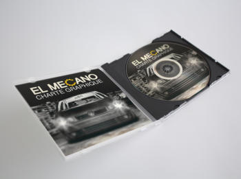
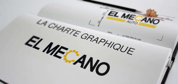
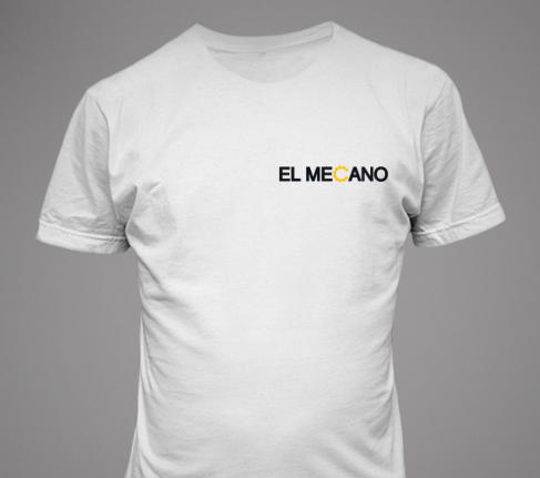
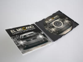
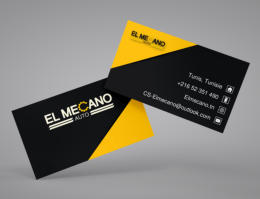
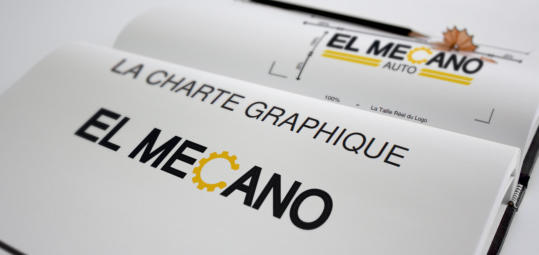
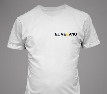
The logo consists of the “Albattar” typography with
two basic colors.
The logo is simple, easy to remember since it is
unique and reflects the company's field of activity
GOOD BRANDS
ARE BUILT WITH INTENTION.
Explore what we could build together.
WE BELIEVE
SELECTED WORK
Brands built with strategy, shaped by identity, and designed to make an impact.
SELECTED WORK
Brands built with strategy, shaped by identity,
and designed to make an impact.
REAL ESTATE AGENCY
The visual identity is built on a refined and elegant
color system combining a deep dark green (#0F1A14)
with a warm golden tone (#D3A63A). The dark green
conveys stability, sophistication, and trust, creating a
strong and premium visual foundation, while the gold
accent introduces a sense of value, prestige, and
warmth. This contrast establishes a balanced hierarchy
between seriousness and refinement, allowing the
brand to feel both professional and distinctive.
TRAVEL AGENCY
The identity combines a geometric triangular symbol
and structured typography to express direction,
precision, and guidance through complex visa
procedures. A blue palette was chosen to convey trust,
reliability, and institutional credibility while maintaining
visual clarity. The system adapts consistently across
print and digital media, reinforcing a professional and
efficient brand presence.
JUICE STORE
QATRA is a juice shop brand identity developed around
the idea of purity, freshness, and natural simplicity,
deeply rooted in the Arabic meaning of its name, which
translates to “a drop of water.” This conceptual
foundation guided the entire visual direction, aiming
to express both hydration and vitality through a
modern and culturally meaningful design language.
CAR GARAGE
The logo consists of the “Albattar” typography with
two basic colors.
The logo is simple, easy to remember since it is
unique and reflects the company's field of activity
GOOD BRANDS
ARE BUILD WITH INTENTION.
Explore what we could build together.
WE BELIEVE
REAL ESTATE AGENCY
The visual identity is built on a refined and elegant
color system combining a deep dark green (#0F1A14)
with a warm golden tone (#D3A63A). The dark green
conveys stability, sophistication, and trust, creating
a strong and premium visual foundation, while the
gold accent introduces a sense of value, prestige,
and warmth. This contrast establishes a balanced
hierarchy between seriousness and refinement, allowing
the brand to feel both professional and distinctive.
TRAVEL AGENCY
The identity combines a geometric triangular symbol
and structured typography to express direction,
precision, and guidance through complex visa
procedures. A blue palette was chosen to convey
trust, reliability, and institutional credibility while
maintaining visual clarity. The system adapts
consistently across print and digital
media,
reinforcing a professional and efficient brand
presence.
JUICE STORE
QATRA is a juice shop brand identity developed
around the idea of purity, freshness, and natural
simplicity, deeply rooted in the Arabic meaning of
its name, which translates to “a drop of water.”
This conceptual foundation guided the entire
visual direction, aiming to express both hydration
and vitality through a modern and culturally
meaningful design language.
CAR GARAGE
The logo consists of the “Albattar” typography with
two basic colors.
The logo is simple, easy to remember since it is
unique and reflects the company's field of activity
GOOD BRANDS
ARE BUILT WITH INTENTION.
Explore what we could build together.
WE BELIEVE
SELECTED WORK
Brands built with strategy, shaped by identity, and designed to make an impact.
Home
Services
Portfolio
About
Home
Services
Portfolio
About
Home
Services
Portfolio
About